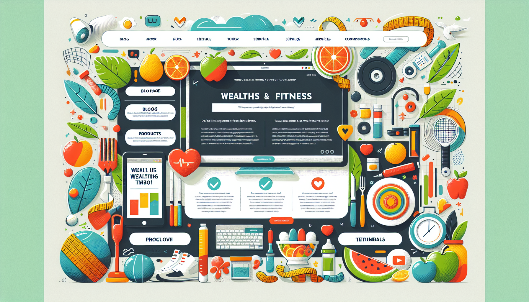
Engaging Website Design
Building a website that captures visitors’ attention for health and fitness companies is a must if we wanna keep folks coming back. The two biggies here? Rocking the right colors and making sure people can find stuff easy-peasy.
Color Vibes
Let’s talk about color vibes. The hues we choose can tweak how visitors feel when they land on our site. Imagine this: fiery reds and oranges get the energy and urgency levels up, making folks wanna move. Meanwhile, mellow blues and greens? Those bring chills and screams health vibes. Sticking with the same color scheme across the board helps us look sharp and consistent, reinforcing our brand’s identity and giving users a visual treat. As said by some savvy people on My Personal Trainer Website, our color choices totally steer how users groove around our site.
| Color | Emotion | Common Usage |
|---|---|---|
| Blue | Trust, calm | Backgrounds, call-to-action buttons |
| Red | Energy, urgency | Promotions, highlights |
| Green | Health, tranquility | Backgrounds for health products |
| Orange | Enthusiasm, excitement | CTAs, headlines |
Easy-Breezy Interfaces
Now, about the interface—gotta make the whole browsing A+ easy. Our site must deliver an experience smoother than a smoothie. Navigation, speedy load times, and no-nonsense content are the secret sauces here. When folks visit, they should snatch what they came for without a treasure hunt.
Think simple menus, intuitive designs, and handy search functions that make visitors’ lives easier. Placing important links upfront in the menu or using breadcrumbs for navigation? Yup, that’s what we’re talking about.
The crew at CyberOptik highlights what makes interfaces pop:
- Gadget Harmony: Our sites need to flex on any screen—phones, tablets, you name it.
- Speed Mach 3: No one’s sticking around for a snail-paced site. Keep it snappy under three seconds.
- A+ Action Prompts: Our CTAs should scream “click me” from across the room, whether it’s signing up or diving into those virtual workouts.
Keeping these things in mind when designing means we grab and hold the eyeballs of our crowd, turning their browsing into a wicked easy and fun ride.
Essential Features
When we put our heads together to whip up an awesome website design for health and fitness companies, including easy-to-use features is a must for a top-notch user experience and a friendly community vibe.
Virtual Classes Integration
Adding virtual classes to our website is like a dream come true for folks looking to work out in their pajamas. This feature lets fitness buffs dive into live or recorded workouts without leaving their living room. The latest intel shows that top fitness websites make sure to include virtual classes to keep users coming back for more and to keep the business running smooth as a smoothie (CyberOptik).
To make this feature shine, let’s make sure we’ve got:
- Live Streaming: Tune in to classes as they happen.
- On-Demand Library: Miss a class? No worries—you’ve got a treasure trove of past workouts at your fingertips.
- Interactive Perks: Toss in ways for users to ask questions or get tips during live sessions.
Check out why virtual classes can be a game-changer:
| Perks of Virtual Classes | What’s It Do? |
|---|---|
| Flexibility | Sweat it out any time, no matter your schedule. |
| Accessibility | Jump into classes even if you can’t make it to the gym. |
| Community Building | Get folks chatting and cheering each other on, making everyone’s fitness journey a little brighter. |
Member Login Areas
Member login areas are like the VIP lounge of our website; they’re crucial for a killer user experience and a tight-knit community. With member logins, we can roll out the red carpet, offering tailored experiences and exclusive goodies perfect for each person.
The must-haves for our member login zones include:
- Personalized Fitness Plans: Craft plans just for them, helping track goals and gains.
- Progress Trackers: Handy tools to keep an eye on victories, big and small.
- Community Hubs: Hangout spots for swapping stories and keeping each other pumped.
Member login areas aren’t just a nice-to-have; they’re pivotal for keeping folks around and happy. Here’s a rundown:
| Why Member Login Spots Matter | What’s the Big Deal? |
|---|---|
| Personal Touch | Gives users stuff that’s just right for them. |
| Amps Up Interaction | A spot for users to high-five and bond. |
| Extra Support | Provides bonus resources, boosting motivation and commitment. |
All in all, by weaving in features like virtual classes and member logins, we’re not just making a website—we’re crafting an experience that’ll keep fitness lovers hooked. This strategy ensures a user-friendly journey and helps knit together a community, turning our site into the ultimate hangout for fitness lovers. For more tips on jazzing up user experience, swing by our article on creative web design for fitness brands.
Aesthetic Appeal
Grab your gym shoes, folks! When it comes to making a gym or fitness website pop, good looks aren’t just about a pretty face. It’s all about that first impression that wraps the brand’s heart and soul into one neat package. Think of it like meeting a new gym buddy who actually remembers your name: it’s warm, welcoming, and keeps you coming back for more. Our goal? Create an online experience that makes visitors stick around and want to explore every corner of the virtual gym.
High-Quality Design
This isn’t just about slapping some paint on a site and calling it a day. A top-notch fitness site offers eye candy that actually works—no clutter, just clear paths to whatever you’re searching for. We’re talking snazzy layouts and colors that scream positivity without scaring anyone away. The fonts should be as readable as your go-to protein shake recipe. This combo invites both the casual treadmill jogger and those workout beasts back for more Cactus Mailing.
Here’s our playbook on what makes a site a touchdown:
| What to Tackle | How It Scores Big |
|---|---|
| Layout | Easy to navigate, user-friendly |
| Color Scheme | Energy boost for the eyes |
| Typography | Easy reading, zero squinting |
By focusing on these points, we’re not just drawing people in—we’re keeping them there with the promise that we’ve got their fitness journey covered. Heck, we might even help them meet their marathon goals while we’re at it CyberOptik.
Fitness-Specific Features
Now, beyond the looks, let’s throw in some handy features that speak to the heart of fitness fans. Want to appeal to those looking to break a sweat on their living room floor? Let’s offer:
- Workout videos right when you need ’em
- Tailored fitness plans like a coach in your pocket
- Cool tracking tools, because who doesn’t love stats?
- A buzzing community forum where you can swap tips and tales
These tools bring together like-minded folks, building a community of encouragers and accountability partners, which—if we’re honest—is pretty motivating. This is where the magic happens: offering not just content but a lifestyle space to meet, communicate, and grow Cactus Mailing.
Pair jaw-dropping design with these winning features and bang! Your website isn’t just a site—it’s the gym people love, minus the sweaty machines. Ready to take things a step further? Have a think about how 3D animations for fitness equipment marketing could mix things up or take a peek at creative web design for fitness brands for even more spark.
Visual Elements
So, you’ve landed on our fitness or health website, huh? It’s not just about what you see; it’s about how it makes ya feel. A cool look and some fun stuff to click on can make all the difference. Let’s chat about what really makes our site pop.
Color Scheme Consistency
Colors, colors, everywhere! Without the right mix, our site would be visual chaos. We chose colors that vibe with our crowd and speak the language of our brand. It’s kinda like picking the right playlist for your mood.
Ever heard of color psychology? Well, it’s a thing. Green is all about calm and health. It feels like that peaceful morning run before the chaos kicks in. Slap some bright colors on, and suddenly everyone’s pumped up, ready for that killer workout. It’s like magic, only real. We want colors that match what we stand for and what our site visitors are chasing.
To nail a consistent look, a color chart’s our best bud:
| Color | Feels Like | Where We Use It |
|---|---|---|
| Green | Calm, healthy | Backgrounds, buttons |
| Blue | Trusty and chill | Headers, links |
| Yellow | Energized and lively | Get-you-going buttons |
| Red | Zippy and urgent | “Hey, Look Here!” banners |
Interactive Features
Now, let’s talk about the cool stuff folks can mess around with. Clicking, playing, doing – that’s what gets people hooked. Little surprises, like when you hover over something, and it does a dance, or when you can spin a product around to check it out from every angle. Stuff like quizzes, video workouts, or private member areas – they make people wanna hang out longer and feel like they’re part of a squad.
Picture this: You’re eyeing up some new dumbbells. With some snazzy features, you can see just how that barbell’s gonna look smack bang in your home gym. How neat is that? Adding things like 3D looks at gear or even AR (augmented reality) can make shopping feel like a real adventure. Other neat tools like progress trackers or how-to guides can be the cherry on top.
Research says all this interactive fun can make folks more clued up and happier to stick around. Look into amping up our interactive game with some creative product demo ideas that cheerlead our site visitors’ fitness missions.
In a nutshell, when our colors aren’t clashing and there’s stuff to fiddle with, it’s a recipe for a killer website. This stuff pulls people in, keeps ‘em coming back, and helps win hearts. So, here’s to happy users and a website they can’t help but love!
AI Integration
AI is shaking things up in the fitness world, especially when it comes to how we design our website and strategize our content. By slipping AI-generated images into the mix and offering a more personal touch, we’re making it easier than ever to grab attention and boost our brand.
AI-Generated Gym Images
Let’s take a look at AI-generated gym images. These digital wonders are helping us whip up killer marketing materials for social media buzz, snazzy website layouts, and eye-catching emails. With this tech, we can shout louder than ever about our brand and draw in fresh faces (Recraft AI).
When we talk about fitness gear makers, these AI images showcase products looking their best in every possible setting. They are key for reaching out to all sorts of folks with different fitness dreams. Flashing our stuff in familiar, everyday scenes, we’re reaching far, wide, and boosting sales. Plus, gyms and studios keep their vibe consistent across all channels thanks to AI. This helps us create a recognizable look that makes people trust and remember us.
| Perks of AI-Generated Gym Images | What It Does |
|---|---|
| Versatile marketing tool | Boosts brand clout |
| Targeted appeal for different groups | Grows engagement |
| Unified look across platforms | Builds confidence |
| Creative boost in promotions | Attracts fresh followers |
Personalized Experiences
AI is also playing matchmaker with our clients, diving into fitness stats to dream up workout plans and meal guides that hit the spot. This kind of personalization doesn’t just make people happy and eager to engage; it makes them feel like they’re part of a fitness family (Recraft AI).
Getting these cool tools on our site means we’re leading the charge in fitness marketing. AI is our secret weapon for linking up with audiences by crafting gym setups on the fly, throwing together AI-powered inspiration boards, and delivering those spot-on personal experiences that really hit home. The strategic use of AI doesn’t just make the user experience better; it also cranks up how engaged and loyal folks are to our brand.
For more ways to pump up our fitness brand’s style, check out ways we can jazz things up with interactive product visualization or dip into some 3D animations for our fitness gear marketing.
Mobile-Friendly Design
Importance of Responsiveness
These days, just about everyone’s glued to their phones, and it’s become pretty clear why a mobile-friendly website’s a must-have for health and fitness companies. Picture this: over 60% of folks drop by websites using their mobile phones, while desktops lag behind at 37%. That’s why making sure our design vibes well with any screen size is key. A responsive website means it’s smart enough to morph itself to match whatever you’ve got in your hand, ensuring our stuff is right there for you to find without any hassle.
| Device Type | Percentage of Website Visits |
|---|---|
| Mobile | 60% |
| Desktop | 37% |
| Other | 3% |
SEO Benefits
Responsiveness isn’t just for making your site look good on phones—it plays a big role in our search engine game, too. Google gives a big nod to sites that are mobile-first, meaning they’re indexing what they see on phones. If our site’s all set for mobile, it means we’re scoring better with Google, which probably pushes us up in search rankings.
What’s even better is, with one URL for both mobile and desktop, we don’t sweat over duplicating content, which keeps Google’s bots happy. This simple tweak does wonders for analytical insights, boosting our SEO and making our user experience top-notch. Great benefits roll in like:
- More folks visiting our site
- Faster-loading pages
- Fewer folks saying “Bye” too early
- Better chances of turning eyeballs into engagements or sales
This isn’t just a techy win—it spells growth and success for our health and fitness biz in the online mix. To peek more into how sprucing up web design can lift our marketing spirit, dive into creative web design for fitness brands and ui/ux design for product-focused websites.