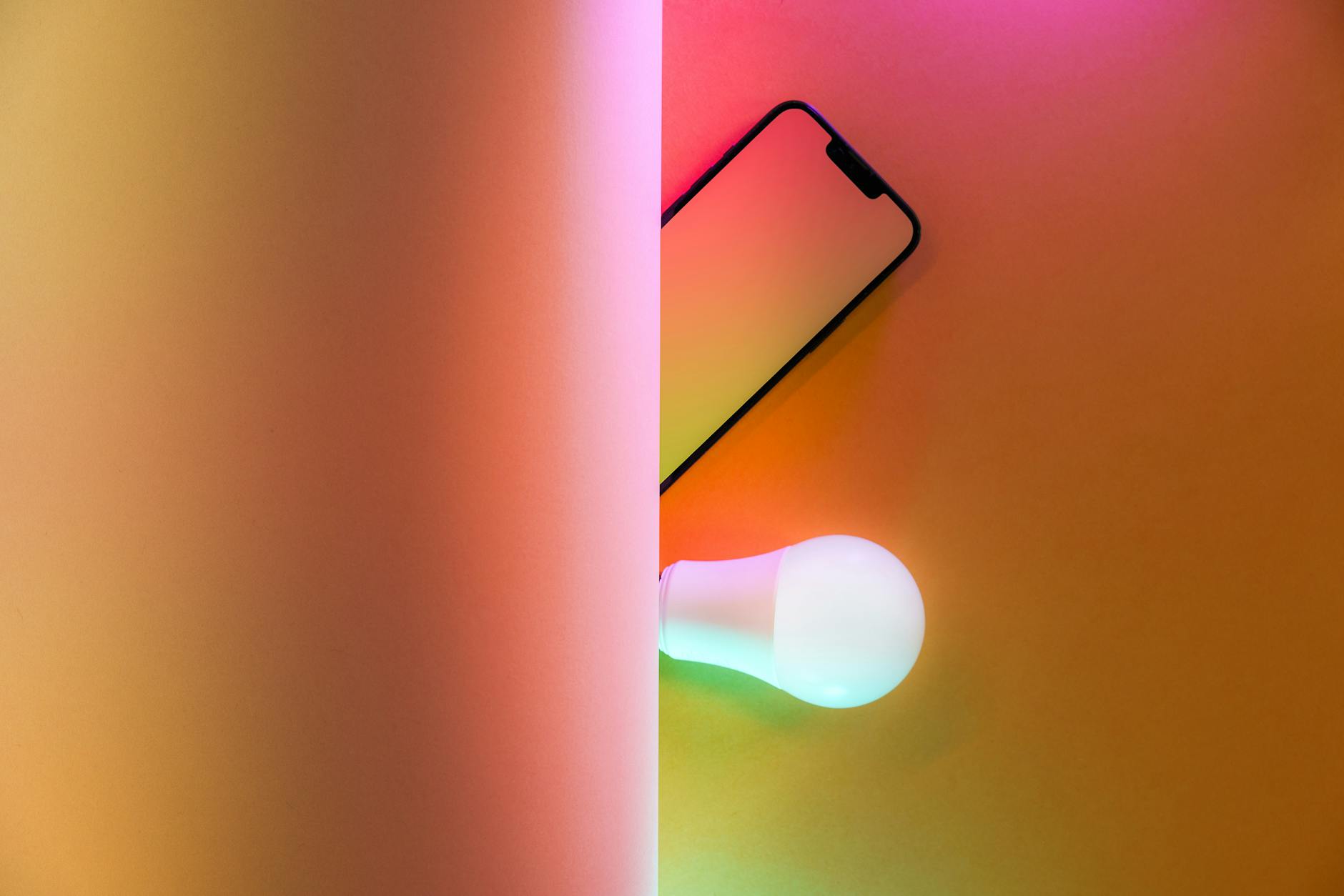
Understanding Color Psychology
The science of color psychology plays a significant role in web design, influencing how users react emotionally and behave on your site. Let’s delve into how colors impact emotions and how this psychological influence translates to user actions.
Impact of Colors on Emotions
Colors hold the power to evoke specific emotions and reactions. By comprehending the emotional connotations of different hues, I can strategically enhance the user experience on my site (SmartBug Media).
Here’s a quick overview of common color associations:
| Color | Emotion/Connotation |
|---|---|
| Blue | Trust, Dependability |
| Green | Growth, Health |
| Orange | Friendliness, Confidence |
| Gray | Balance, Neutrality |
| Red | Excitement, Urgency |
| Yellow | Happiness, Caution |
| Purple | Luxury, Creativity |
Understanding these connections can help in aligning the website’s aesthetic with its intended message and user experience goals (Cosmico Studios).
Psychological Influence on User Actions
Color psychology also significantly impacts user behavior on websites. Selecting the right colors for various elements of my web design, such as call-to-action (CTA) buttons, can dramatically enhance conversion rates (SmartBug Media). For instance, changing a CTA button from green to yellow resulted in a 187.4% increase in conversions for one website.
Making strategic color choices involves recognizing the audience and their cultural context. Different colors might have varied implications across cultures and demographics, influencing how users perceive and interact with the site.
For deeper insights into how colors can optimize user actions, consider exploring persuasive design patterns and other related principles, such as trust signals design and cognitive load design.
By leveraging the principles of color psychology, I can create a visually compelling and emotionally engaging experience that drives users to take desired actions, ultimately improving overall website performance and conversions.
Color Choices in Web Design
Selecting the right colors is essential for an effective website. It influences user experience and conversion rates significantly. Two critical factors to consider are cultural context and accessibility.
Cultural Context Considerations
Color meanings can vary widely across cultures. Designers must understand these variations to communicate effectively and avoid misinterpretations. For example, while white can symbolize purity in some cultures, it represents mourning in others.
To illustrate, here is a table showing the differing cultural connotations of some colors:
| Color | Western Culture | Eastern Culture |
|---|---|---|
| White | Purity, Wedding | Mourning |
| Red | Love, Passion | Prosperity, Luck |
| Black | Power, Elegance | Mourning |
| Yellow | Happiness, Energy | Cowardice |
Taking into account cultural contexts, businesses can foster a better connection with their global audiences, potentially leading to higher conversion rates. For more tips on optimizing your design for cultural sensitivity, check out our article on ui pattern recognition and mental models in ux design.
Accessibility and Color Contrast
Accessibility in web design ensures that websites are usable by individuals with disabilities. High contrast between text and background significantly improves readability for users with low vision or color blindness. According to Cosmico Studios, effective use of color contrast is crucial for inclusivity.
Web Content Accessibility Guidelines (WCAG) recommend a contrast ratio of at least 4.5:1. Here’s a table illustrating example contrast ratios:
| Text Color | Background Color | Contrast Ratio | WCAG Compliance |
|---|---|---|---|
| Black | White | 21:1 | Compliant |
| Dark Gray | Light Gray | 7:1 | Compliant |
| Blue | Light Blue | 3:1 | Non-compliant |
Utilizing tools like color contrast checkers can ensure your website meets accessibility standards. Consistent brand colors across your site not only foster brand recognition but also build trust (New Target). To further improve your site’s accessibility and user experience, consider exploring white space psychology and visual hierarchy psychology.
By understanding the cultural context and prioritizing accessibility, you can create a web design that resonates with a diverse audience and ensures an inclusive experience for all users.
Enhancing User Engagement
For marketing heads and business owners, understanding how color psychology can enhance user engagement and conversions is vital. Let’s delve into the significance of color harmony and utilizing color schemes in web design.
Importance of Color Harmony
Color harmony is crucial for crafting visually appealing and coherent web designs. It can directly influence user engagement by creating a pleasant, inviting atmosphere on your site. Disharmonious colors can lead to a lack of focus and even decision fatigue.
Several methods can achieve color harmony. These include analogous, complementary, and triadic color schemes, each providing a different aesthetic effect:
- Analogous Schemes: Utilize colors that are next to each other on the color wheel. They create a serene and comfortable design that is pleasing to the eye. Ideal for creating a calm and cohesive look.
- Complementary Schemes: Involve colors opposite each other on the color wheel. These high-contrast combinations make elements stand out, which is particularly effective for call-to-action buttons and ensuring the legibility of text.
- Triadic Schemes: Use three evenly spaced colors on the color wheel. This method yields a vibrant and balanced design, fostering high visual interest and engagement.
Utilizing Color Schemes
Effectively utilizing color schemes in web design can enhance user experience and engagement. Choosing the right color combinations can significantly impact how users interact with your site and perceive your brand.
| Scheme Type | Description | Example Use Case |
|---|---|---|
| Analogous | Colors next to each other on the wheel; serene and comfortable. | Backgrounds and borders |
| Complementary | Opposing colors; high contrast; makes elements stand out. | Call-to-action buttons |
| Triadic | Three evenly spaced colors; vibrant and balanced. | Main navigation, headers |
For instance, a complementary scheme can be used for call-to-action buttons to draw immediate attention, increasing the likelihood of conversion. Analogous schemes can create a cohesive background that enhances readability and comfort (Cosmico Studios).
Color contrast is another essential element, particularly for accessibility. High contrast between text and background ensures that your content is readable for all users, including those with visual impairments.
Incorporating color psychology and well-researched color schemes can transform your website from just another page to a powerful tool for engaging and converting users. Whether it’s through the serene consistency of analogous colors or the eye-catching appeal of complementary contrasts, the right color choices can make a significant difference. For more on practical applications of this, check out our section on psychological effects of different colors.
Strategies for Conversion Optimization
A/B Testing Color Variations
A/B testing is an essential tool for identifying which colors resonate best with users on your website or application. By comparing different color schemes for elements like Call-To-Action (CTA) buttons, you can determine which variant drives more conversions.
For instance, changing a CTA button from green to yellow resulted in a 187.4% increase in conversions on a website (SmartBug Media). Testing different color options allows you to gather concrete data on user preferences.
Key Considerations:
- Sample Size: Ensure a large enough sample size to make results statistically significant.
- Control Variables: Keep other variables constant to isolate the effect of color changes.
- Duration: Run tests for a sufficient period to account for daily and weekly traffic variations.
| Color Variant | Conversion Rate Increase |
|---|---|
| Green to Yellow | 187.4% |
| Blue to Red | 21.5% |
| Orange to Green | 12.3% |
See more on best A/B testing tools to use for your experiments.
Colors for Call-To-Action Buttons
The color of CTA buttons can significantly impact user behavior and conversions. Specific colors—red, green, orange, and yellow—are considered the highest-converting for CTAs (SmartBug Media).
Color Implications:
- Red: Signals urgency and attracts attention. Ideal for limited-time offers.
- Green: Associated with action and positivity. Encourages users to proceed.
- Orange: Radiates warmth and is inviting. Effective for sign-ups or subscriptions.
- Yellow: Evokes feelings of happiness and optimism. Works well for light-hearted calls-to-action.
Achieving color harmony and contrast is crucial for creating visually appealing and accessible designs. High-contrast color combinations enhance CTA visibility and ensure text legibility (Cosmico Studios).
Explore more about psychological effects of different colors in web design to choose the best color for your CTA buttons. For further insights on improving user engagement, check out our articles on visual hierarchy psychology and cognitive load design.
Branding and Color Associations
Implications for Brand Identity
In web design, the influence of color psychology is significant. Colors impact the way consumers think and feel, which can translate into their actions. For instance, companies like Coca-Cola use red to evoke excitement and passion, while brands like Facebook use blue to communicate trust and reliability (Digital Silk). Selecting the right colors is crucial for shaping the identity and perception of a brand.
| Brand | Primary Color | Common Associations |
|---|---|---|
| Coca-Cola | Red | Excitement, passion |
| Blue | Trust, reliability | |
| McDonald’s | Yellow | Happiness, friendliness |
| Apple | Black | Sophistication, elegance |
The strategic use of color in branding can significantly impact how a brand is perceived. The correct color choice can enhance brand recognition, convey brand values, and differentiate the brand from its competitors (Cosmico Studios). For example, if a brand wants to position itself as eco-friendly, it might use green to symbolize nature and sustainability.
Consistency in Color Usage
Consistency in color usage is essential for reinforcing brand recognition. A mismatch between brand identity and the website’s color scheme can lead to confusion and diminish credibility (New Target). Consistent application of the chosen color palette across all brand touchpoints ensures that the brand remains memorable and recognizable to consumers.
To maintain consistency, consider the following:
- Ensure your brand colors are used uniformly across logos, websites, social media, and marketing materials.
- Use a color hex code for precise color matching.
- Create a brand style guide outlining primary and secondary colors, as well as acceptable shades and tints.
Maintaining color consistency helps build trust with the audience. If users visit a website and see different colors each time, they may perceive the brand as disorganized or unreliable. On the other hand, consistent color usage strengthens trust signals and enhances user perception.
By understanding the implications of color psychology in web design, you can leverage it to optimize user experience and conversion rates. For example, specific color choices for call-to-action buttons can significantly impact user engagement. Explore best practices and guidelines in our articles on emotional design principles and visual hierarchy psychology to further refine your approach.
Practical Applications of Color Psychology
Psychological Effects of Different Colors
When it comes to web design, understanding the psychological influence of colors can help optimize user engagement and conversion rates. Different colors evoke specific responses among visitors, and using the right hues can significantly impact how users perceive and interact with a website. Here’s a brief rundown on the psychological effects of various colors:
| Color | Emotion/Response | Usage |
|---|---|---|
| Black | Classy, Corporate, Authoritative | Luxury brands, Formal businesses |
| Blue | Cold, Tranquil, Stabilizing | Financial services, Tech companies (Canva) |
| Brown | Natural, Earthy, Dependable | Environmental brands, Coffee shops |
| Green | Relaxing, Refreshing, Progressive | Health and wellness, Eco-friendly products |
| Orange | Warmth, Buoyant, Playful | Entertainment, Call-to-action buttons |
| Red | Intense, Aggressive, Powerful | Retail brands, Emergency services |
| Yellow | Bright, Thought-provoking, Cautionary | Children’s products, Warning signs |
| White | Fairness, Purity, Excellence | Minimalist designs, Healthcare |
These color associations can help in creating a design that aligns with the emotional tone and functional goals of your website. For example, if your aim is to invoke trust and professionalism, blue might be a suitable choice. On the other hand, if you wish to stimulate urgency and action, red could be more effective.
Customer Perception and Response
Leveraging color psychology in web design not only influences emotions but also affects customer perception and actions. Studies have shown that color increases brand recognition by 80%. Here’s how different colors can sway customer responses:
| Color Preferences by Industry (in %) | Financial Services | Fast Food Brands | Apparel | Retail |
|---|---|---|---|---|
| Blue | 75 | 20 | 10 | 30 |
| Red | 15 | 60 | 0 | 60 |
| Green | 10 | 5 | 5 | 5 |
(Data derived from Lauren Labrecque and George Milne’s research)
For example, blue is predominantly used in financial services to evoke a sense of trust and reliability, while red is prevalent in fast food brands to stimulate appetite and excitement. The strategic use of color in branding can make a brand stand out and communicate its values effectively to the target audience (Cosmico Studios).
Reviewing these psychological effects and industry-specific color preferences can guide the choice of colors for your website or application, enhancing both aesthetic appeal and functionality. For more detailed strategies, consider exploring our articles on visual hierarchy psychology and emotional design principles. These concepts can provide further insights into creating a design that not only captivates but also converts users.
To optimize conversions, especially for call-to-action buttons, it can be valuable to conduct A/B testing of color variations. For example, a test by HubSpot found that red buttons outperformed green buttons by 21% (SmartBug Media). This reinforces the importance of testing and iterating based on data-driven insights rather than assumptions.
Harnessing the power of color psychology can transform your web design, making it a more engaging and effective tool for achieving your marketing and business objectives.